Our New Logo – What It Means & Why We Did It
As you may have noticed over the past few weeks, American Access Company has a new logo. We would like to share the reasons why we changed our logo and explain what it symbolizes.
Why We Changed Our Logo
The reason behind our logo change is actually quite simple. We want to show more distinction between American Access Company and our parent corporation—The American Fence Company.
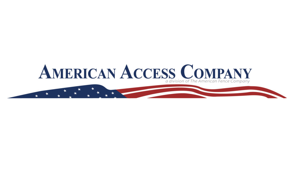
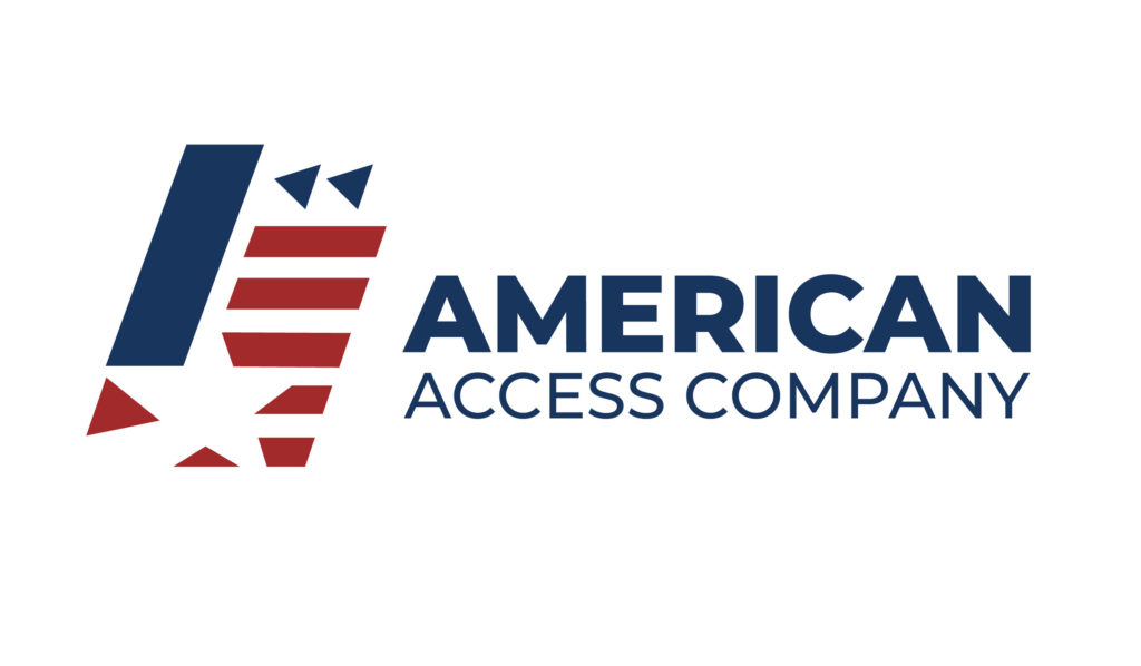
Our previous logo (above) was an exact replica of the American Fence Company’s logo and did not reflect our specialization in gate automation and access control, so we felt a change was in order. After careful consideration and design, we came up with a new logo (seen below) to better represent our division and what we specialize in.
What Our New Logo Means
Access control is largely about security and controlling the flow of traffic coming in and out of your property. To symbolize that, the new design uses directional triangles to indicate the flow of traffic through controlled access points—blue to blue and red to red.
We used the diagonal slants to imply movement and automation, while the stripes reference gate openings.
Finally, to tie back into our parent corporation and our pride in American-made gates and access control systems, we added a star in the negative space between the blue and red blocks. (Can you spot it?)
Same Company—Different Look
At the heart of it all, we’re still the same American Access Company. We still provide the same quality of service and attention to detail—just with a newer, more recognizable look.